Brand
guidelines
Aerial systems that work together.
Contents
Everything needed to present JoltB consistently: the mark, its colours and type, how we speak, and ready-made files. When something is not covered here, choose the plainer option.
- 01ContentsWhat is in this guide
- 02Brand essencePurpose, position, personality, principles
- 03Logo systemLockups, symbol, wordmark, construction, clear space, sizes
- 04Colour versionsFull colour, one colour, black and white
- 05MisuseWhat never happens to the mark
- 06Symbol usageWhen the symbol stands alone
- 07ColourValues, ratios and accessible pairings
- 08TypographyFamilies, scale, rules, licensing
- 09Layout and gridColumns, margins, spacing
- 10UI and HUDData labels, unit tags, team colours
- 11Terrain and imageryThe contour motif and photography
- 12MotionTiming, easing, what moves
- 13Voice and toneHow JoltB speaks
- 14NamingCompany, units, teams, versions, files
- 15ApplicationsStationery, social, slides, labels, web
- 16DownloadsThe complete asset kit
Brand essence
What the brand stands on. Every choice in this guide traces back to this page.
Make hard aerial work simple enough for one person to run.
JoltB builds modular, autonomous, cooperative aerial systems. Separate aircraft work as one team, directed through one core, so a single operator can cover ground that used to take a crew.
We talk about the category and the outcome: the ground covered, the time saved, the work made simple. We never describe how the product is built.
02.1Personality
Rugged
Built to be used outdoors, marked and handled. Heavy type, hard edges, materials that survive.
Not military. Not macho. No camouflage, weapons or threat imagery.
Direct
Say the fact first. Short declarative lines, radio-procedure brevity.
Not curt or cold. Direct is a courtesy to someone who is busy.
Field-ready
Everything works in bad light, one colour and small sizes. Tested before it is shown.
Not sci-fi. No glowing interfaces, lens flares or futurism.
02.2Principles
- Say it once. One idea per line, one message per page. If a word can go, it goes.
- One signal. Signal Red means the core, a find, or the next action. Used anywhere else it stops meaning anything.
- Built to be marked. Every asset must work stamped, sprayed, engraved or printed in one colour.
- Show the work, not the machine. We show terrain, coverage and people at work. We never draw the aircraft and never show pieces interlocking.
Logo system
The logo has two parts. The wordmark is JOLTB drawn as heavy stencil caps. The symbol is three brackets standing apart around one lit core: separate aircraft, one core. Always use the supplied files; never retype or redraw either part.
03.1Primary lockup · horizontal
The default signature for everything: web, documents, stationery, video end frames.
03.2Stacked lockup
For square and narrow formats: social tiles, labels, packaging ends.
03.3Symbol
Stands alone only where JoltB is already known: app icon, avatar, favicon, equipment.
03.4Wordmark
The name alone, when the symbol already appears nearby or space is very wide and short.
03.5Construction
Both parts are drawn on a 100-unit grid. These drawings are for understanding only: reproduce the logo from the master files.
- Cap height
- 100 units, every letter
- Stroke
- 22 units, square ends, mitred corners
- Bridges
- 5 units, one per letter, two on the O (red)
- Spacing
- J 14 O 12 L 6 T 12 B, optically set
- Brackets
- Three, on a pointy-top hexagon of radius 40, repeated at 120°
- Stroke
- 7 units, mitred
- Open corners
- 16% of a side each way (red); brackets never touch
- Core
- Solid hexagon, radius 14; the only red in the logo
03.6Clear space
Clear space X is the height of the core at the size the logo is used. Keep at least X free on every side: no type, edges, folds or other marks inside it.
Horizontal: X = 0.35 × wordmark height
Stacked: X = 0.54 × wordmark height
03.7Minimum sizes
Below these sizes the bridges and open corners close up. Shown here at actual digital size.
| Asset | Digital | At minimum size | |
|---|---|---|---|
| Horizontal lockup | 120 px wide | 30 mm wide | |
| Stacked lockup | 72 px wide | 20 mm wide | |
| Wordmark | 80 px wide | 20 mm wide | |
| Symbol | 16 px | 5 mm |
For embroidery, engraving and spray stencils, double the print minimums.
Colour versions
Full colour is the default. One-colour versions are for single-ink printing, engraving, stencils and embroidery. Pick the version by the background, not by taste.
On photographs, use the sand or white version over a calm, dark area, or the olive or black version over a calm, light area. If no calm area exists, move the logo or change the image.
Misuse
The logo is only recognisable if it is always the same. Each of these breaks it.
Symbol usage
Three brackets standing apart around one lit core: separate aircraft, one core. The symbol is the shortest form of the brand and it earns the most use, so it has the strictest rules.
06.1Where it stands alone
- App icon, favicon and social avatar.
- Equipment labels and decals, next to the unit tag.
- HUD and software chrome, where the name is already on screen.
- End frames and slide footers after the full lockup has appeared.
Everywhere else, use a lockup. The symbol never replaces the name on a first introduction.
06.2Rules
- Always all three brackets and the core. Never crop, split or repeat them into a pattern.
- The core is the only red. Red on light, Signal Lit on dark, or the single ink in one-colour work.
- Nothing goes inside the core: no letters, numbers or icons.
- The brackets never move. In motion only the core may blink.
06.3Size ladder
Clear from 16 px up. For browser tabs use the supplied 16 and 32 px favicon files rather than scaling the SVG.
06.4App icon
Olive black rounded square, corner radius 22% of the side, symbol scaled to 78% and centred. Supplied at 1024, 512 and 180 px, with 32 and 16 px favicons.
Radius 22 · symbol box 78 · centred
Never draw the aircraft. Never show pieces interlocking.
The brand talks about what the systems do, never how they are made. No illustrations, silhouettes, icons, renders or diagrams of an aircraft; no animation or artwork in which the brackets, or anything else, join or fit together. The symbol is only ever three brackets standing apart around one core.
Colour
Four colours, used in fixed proportions. Olive black and sand do the work; field supports; Signal Red is rare on purpose, so that when it appears it means something.
- HEX
- #1B1D17
- RGB
- 27 29 23
- CMYK
- 65 55 75 80
- Pantone*
- ≈ 419 C
Primary ink and dark surfaces. Type, the wordmark, night panels.
- HEX
- #ECE7DA
- RGB
- 236 231 218
- CMYK
- 6 7 14 0
- Pantone*
- ≈ 7527 C
Paper and light surfaces. The day UI background and the ink on dark.
- HEX
- #6B7550
- RGB
- 107 117 80
- CMYK
- 55 35 80 25
- Pantone*
- ≈ 5757 C
Secondary. Contour lines, rules, Team C, supporting panels.
- HEX
- #C7361F
- RGB
- 199 54 31
- CMYK
- 10 90 100 5
- Pantone*
- ≈ 173 C
The core, finds and calls to action. Nothing else.
07.1Proportion
Approximate share of any layout, page or screen. Red never exceeds a tenth.
07.2On dark and in the interface
Red loses energy on dark surfaces, so the core, finds and calls to action switch to Signal Lit. The night interface sits on Night, a step darker than olive black; the day interface sits on Sand.
- HEX
- #E0452B
- RGB
- 224 69 43
- CMYK
- 0 85 90 0
- Pantone*
- ≈ 7417 C
Signal Red on dark backgrounds: the lit core, finds and calls to action.
- HEX
- #11120E
- RGB
- 17 18 14
- CMYK
- 70 60 75 90
- Pantone*
- ≈ Black 6 C
Night UI background only.
Left: night value · right: day value
07.3Accessible pairings
WCAG 2.2 contrast ratios, computed from the HEX values. Body text needs AA (4.5:1). Large text and interface graphics need 3:1.
| Sample | Text | Background | Ratio | Grade | Use |
|---|---|---|---|---|---|
| Aa | Olive Black | Sand | 13.78:1 | AAA | Default day textAny text |
| Aa | Sand | Olive Black | 13.78:1 | AAA | Default dark textAny text |
| Aa | Sand | Night | 15.23:1 | AAA | Night UI textAny text |
| Aa | White | Signal Red | 5.28:1 | AA | Buttons, alertsAny text |
| Aa | Signal Red | Sand | 4.28:1 | AA Large | Large calls, find markers≥ 24 px, or ≥ 19 px bold; UI graphics |
| Aa | Signal Lit | Night | 4.53:1 | AA | Night finds, alertsAny text |
| Aa | Signal Lit | Olive Black | 4.09:1 | AA Large | Large calls on dark≥ 24 px, or ≥ 19 px bold; UI graphics |
| Aa | White | Field | 4.90:1 | AA | Labels on field panelsAny text |
| Aa | Field | Sand | 3.97:1 | AA Large | Large text, rules, contours≥ 24 px, or ≥ 19 px bold; UI graphics |
| Aa | Sand | Field | 3.97:1 | AA Large | Large text on field panels≥ 24 px, or ≥ 19 px bold; UI graphics |
| Aa | Olive Black | Field | 3.47:1 | AA Large | Large text only≥ 24 px, or ≥ 19 px bold; UI graphics |
| Aa | Signal Red | Olive Black | 3.22:1 | AA Large | Use Signal Lit instead≥ 24 px, or ≥ 19 px bold; UI graphics |
Buttons use white on Signal Red (5.28:1). Signal Red text on sand is for headings and markers at 24 px or larger only.
* Pantone references are the nearest approximations for guidance only; CMYK values are starting points for coated stock. Always proof against a current Pantone guide and a printed swatch before approving a job.
Typography
Three families, all free and open source. Barlow Condensed is the voice at the top of the page, Barlow carries the reading, and IBM Plex Mono is reserved for data.
Aa
Barlow Condensed
600 · 700
Headings, labels, buttons. Always uppercase.
Built for the field.
Aa
Barlow
400 · 500 · 600
Paragraphs, captions, forms. Sentence case.
Small machines that fly on their own and share what they see.
Aa
IBM Plex Mono
400 · 500
HUD values, unit tags, figures, file references.
SEC 04 CLEAR · MOVING TO 05 · ETA 02:40
08.1Type scale
Sizes in px at 1× for screen; for print use the same numbers in pt. Line height is a multiple of the size.
Sector 04 clear.
Sector 04 clear.
Sector 04 clear.
Aerial systems that work together
Aerial systems that work together
Separate aircraft work as one team, directed through one core.
Separate aircraft work as one team, directed through one core.
Separate aircraft work as one team, directed through one core.
J-04 · TEAM A · CORE r2 · LINK OK
08.2Rules
- Display type is always uppercase, left aligned, tight: line height 0.9 to 1.1.
- Body text is sentence case, 60 to 75 characters a line, never justified.
- Mono is for data only: values, tags, codes, timestamps. Never for paragraphs.
- Two weights per layout at most. Emphasis is weight, never italics or underline.
- Never set the name JoltB in Barlow Condensed as a logo substitute; use the wordmark.
- Keep digits in mono tabular so columns of numbers align.
08.3Licensing and fallbacks
All three families are licensed under the SIL Open Font License 1.1: free for commercial use, print, web embedding and apps. They may be bundled with software; they may not be sold on their own.
| Family | Download | Fallback |
|---|---|---|
| Barlow Condensed | Google Fonts | Arial Narrow, sans-serif |
| Barlow | Google Fonts | system-ui, sans-serif |
| IBM Plex Mono | Google Fonts | ui-monospace, monospace |
In Microsoft Office where the fonts cannot be installed, use Arial Narrow Bold for headings and Arial for text.
Layout and grid
Layouts are built like a field manual: a strict grid, hard edges, a clear top-left entry point and plenty of empty ground. Content hangs from the top-left, never floats in the centre by default.
09.1Screen grid
12 columns, 24 px gutters, 1240 px maximum content width. Margins 32 px on desktop, 16 px on mobile with 4 columns.
09.2Print grid
A4: 15 mm margins, 12 columns, 5 mm gutters. The logo sits in the top-left corner, aligned to the margin at its clear-space edge.
09.3Spacing and form
- All spacing is a multiple of 4 px. Section breaks use 96 px on screen, 20 mm in print.
- Hard corners. Controls may take a 2 px radius; nothing else is rounded except the app icon.
- Rules are 1 px field or 2 px olive black. No drop shadows, no gradients, no glows.
- One red element per view: the call to action or the find, not both.
- Section numbers in mono at the top-left of every section and slide.
- Leave at least a third of any page or slide empty.
UI and HUD
The interface speaks in the same voice as the brand: terse, labelled, legible in bad light. Data is always mono and uppercase; the human-facing layer is Barlow. The night UI is the reference; day mirrors it on sand.
10.1Data labels
IBM Plex Mono, uppercase, +0.06em tracking. Label at 60% opacity, value at full: COV 86%
Units always carry their unit of measure; times are 24-hour, zero-padded.
10.2Unit tags
A 1 px frame in the team colour around the unit ID. The core tag is solid.
10.3Team colours
- Team A Signal red
- Team B Olive on day, sand on night
- Team C Field green
Red is also the find colour. On screen, a find is always a ring plus a label, never colour alone.
Terrain and imagery
Contour lines are the brand’s texture: ground seen from above, measured. They come from the same terrain the website flies over. They say coverage and altitude without showing a single machine.
11.1Using the motif
- Line colour one step from the ground: field on olive, a darker sand on sand, olive on field.
- Crop freely and let lines run off the edge. Never frame the motif in a box.
- Keep the logo on a calm area; if lines run under it, drop them to 15% there.
- Flat lines only. No hill-shading, 3D extrusion, gradients or glow.
- Sector grid lines and labels may be overlaid in mono, as on a map.
11.2Imagery
- Real ground from real altitudes: valleys, coast, farmland, forest edges.
- High horizon or straight down. Overcast or low sun. Natural, slightly muted colour.
- People at work in the field: operators, briefings, hands on a tablet, boots on the ground.
- No stock “drone” shots, sci-fi overlays, lens flares or night-vision green.
Never draw the aircraft. Never show pieces interlocking.
No photographs, renders, silhouettes or icons of JoltB hardware in brand material. No close-ups of parts. Map markers are plain dots and rings. Imagery shows the ground covered and the people doing the work.
Motion
Motion follows procedure: deliberate, short, and it stops. Things move to report a change in state, never to decorate.
Cut, then settle
Elements arrive quickly and settle without overshoot. No bounce, no elastic, no spring.
State, not show
Animate only what changed: a unit reporting, a sector clearing, a value updating.
The core blinks
The only repeating motion is the core blinking to show a live link. The brackets never move.
12.1Timing and easing
Easing cubic-bezier(0.2, 0, 0, 1) for movement; linear for progress and data. The blink uses steps(2, jump-none) at 1.2 s: on, off, no fade.
12.2Live link
Respect reduced-motion settings: the core stays lit and nothing animates.
Voice and tone
We sound like a good radio operator: calm, brief, specific. Say what happened, then what happens next. The tagline sets the register: “Aerial systems that work together.”
Built for the field.
Sector 04 clear. Moving to 05.
Brief us.
13.1How we write
- Fact first. Lead with what happened or what we do.
- Short lines. Full stops over commas. Most sentences under 12 words.
- Plain words. “Cover”, “find”, “clear”, “team”. No jargon, no hype.
- Numbers as digits. “9 aircraft”, “Sector 04”, “02:40”.
- No exclamation marks. Confidence does not shout.
13.2Tone by context
| Website | Confident and outcome-led. “Cover the whole valley before lunch.” |
| Interface | Status, then action. “J-06 holding. Awaiting orders.” |
| Warm but brief. “Thanks for the brief. We can fly Tuesday.” | |
| Hiring | Straight about the work. “Hard problems, small team, real flights.” |
| Errors | What happened, what we are doing, what you can do. |
13.3Do and don’t
Sector 04 clear. Moving to 05.
Great news! We’ve successfully finished scanning the area and are now heading over to the next one.
Built for the field.
Revolutionary, cutting-edge drone technology for tomorrow’s world.
Brief us.
Click here to learn more about how we can help you!
One operator. One team.
Our AI-powered swarm seamlessly disrupts aerial operations.
Link lost. Holding position.
Oops! Something went wrong. Please try again later.
Words we avoid: revolutionary, disrupt, seamless, cutting-edge, next-gen, swarm, game-changing, unleash. We say team, not swarm.
Naming
Names are data. They are read aloud over a radio, printed on a label and sorted in a list, so they follow one pattern everywhere.
| Thing | Write it | Rule | Never |
|---|---|---|---|
| Company | JoltB | One word, capital J and B. “JOLTB” only in the wordmark and in mono data. | Joltb · Jolt B · Jolt-B · JOLT-B |
| Units | J-01 … J-09 | J, hyphen, two digits. A unit keeps its ID for life. | J1 · j-01 · Unit 1 · J01 |
| Teams | Team A · B · C | Single capital letter. In the HUD: TEAM A. | Team 1 · Alpha · team a |
| Core versions | r1 · r2 | Lowercase r and a whole number. “Core r2” in text. | R2 · v2.0 · rev. 2 |
| Sectors | Sector 04 · SEC 04 | Two digits. Long form in speech and text, SEC in the HUD. | Sector 4 · S4 |
| Missions | Mission 0412 | Four digits, no prefix letters. | M-412 · Op 412 |
| Files | joltb-lockup-horizontal-fullcolour-on-dark.svg | Lowercase, hyphenated: brand, asset, layout, version, size. | JoltB Logo FINAL v3 (2).png |
Applications
The system applied. Names, numbers and addresses shown are placeholders. Build every new item from these patterns before inventing a new one.
15.1Business card
85 × 55 mm, 400 gsm uncoated natural stock. Front olive black, back sand. Name in Barlow Condensed, details in Plex Mono.
15.2Letterhead
A4, 15 mm margins. Lockup top-left, reference line in mono, contour strip at the foot.
15.3Email signature
Live text plus the 2× PNG lockup at 120 px wide. No banners, quotes or social icons.
Thanks for the brief. We can fly Tuesday.
15.4Social
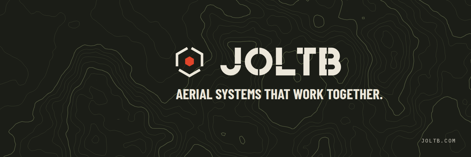
Avatar: the symbol on olive black, sized to survive a circle crop. Banners: lockup and tagline inside the safe area, contour lines as texture.
15.5Presentation slide
16:9. Section number and title top-left, one idea per slide, symbol in the footer.
15.6Equipment label and decal
Vinyl or anodised plate, rectangular only. Unit data in Plex Mono; team colour as a solid bar.
One-colour decal · sand on field
15.7Website header
Lockup left, three links, one red call to action. Headline in display type.
Aerial systems that work together.
Downloads
Every file in the kit. SVGs are self-contained vectors with literal colours; PNGs are transparent unless they are a finished image. Download the whole kit as one ZIP.
Package
Everything below in one archive, with a README listing the files and font links.
Horizontal lockup
Primary signature. Vector, plus transparent PNG 2000 px wide.












Stacked lockup
For square and narrow spaces.












Symbol
Three brackets and the lit core. Transparent PNG at 512 and 1024 px.
- Full colour on darkSVG
- Full colour on darkPNG · 512 px
- Full colour on darkPNG · 1024 px
- Full colour on lightSVG
- Full colour on lightPNG · 512 px
- Full colour on lightPNG · 1024 px
- One colour · sandSVG
- One colour · sandPNG · 512 px
- One colour · sandPNG · 1024 px
- One colour · olive blackSVG
- One colour · olive blackPNG · 512 px
- One colour · olive blackPNG · 1024 px
- BlackSVG
- BlackPNG · 512 px
- BlackPNG · 1024 px
- WhiteSVG
- WhitePNG · 512 px
- WhitePNG · 1024 px


















Wordmark
The name alone, for when the symbol already appears nearby.




App icon and favicons
Olive black rounded square, symbol at 78%.



Social
Ready to upload. Keep the platform crop in mind; the marks sit inside the safe area.

Fonts are not included in the kit; they are free from Google Fonts: Barlow Condensed, Barlow, IBM Plex Mono.